Lighting Design: Illuminating Your Home with Style and Functional Light Fixtures
May 30, 2024
Garden Suites: Discover New Possibilities in Toronto
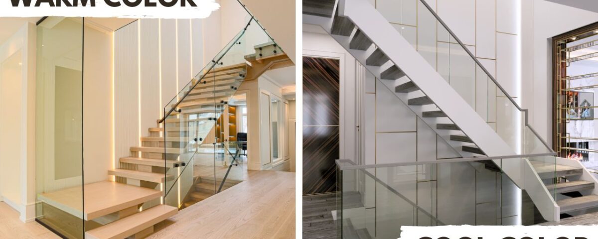
June 12, 2024Color has a huge impact on our emotions and perceptions, influencing everything from our mood to our productivity. In the realm of interior design, the right choice of color schemes can transform spaces, making them more beautiful and inviting. Let’s explore how different color schemes affect us and how they can be effectively used in architectural design to create uplifting environments.
The Science of Color Schemes Choice
Color psychology studies how hues affect human behavior and emotions. Different colors can evoke various psychological responses, often subconsciously. Here’s a brief overview of common colors and their psychological impacts:
- Red: Associated with energy, passion, and excitement. Red can stimulate the senses and raise energy levels, making it an excellent choice for spaces meant for physical activity or social interaction.
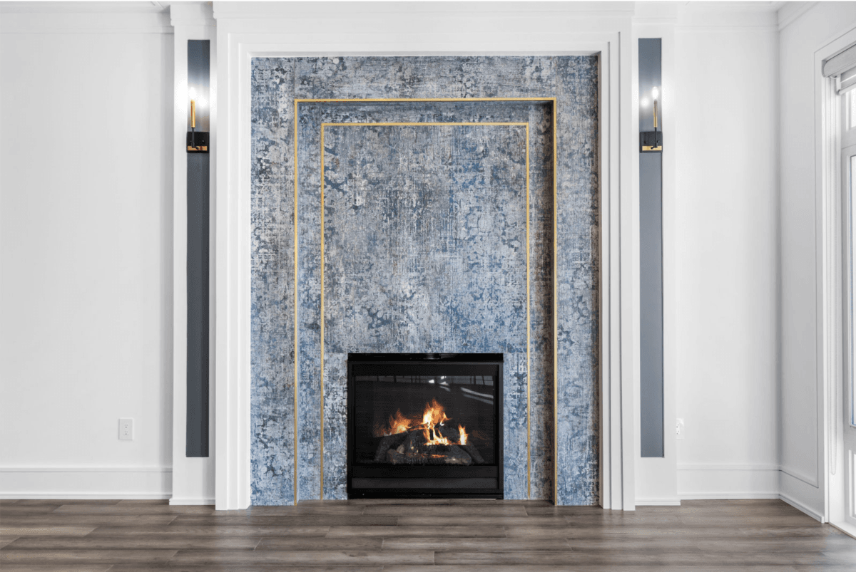
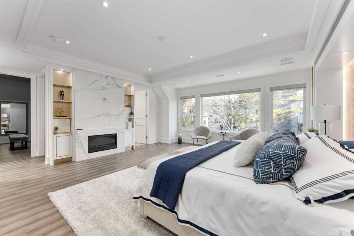
- Blue: Known for its calming and soothing effects. Blue is ideal for spaces where relaxation and tranquility are desired, such as bedrooms and bathrooms.
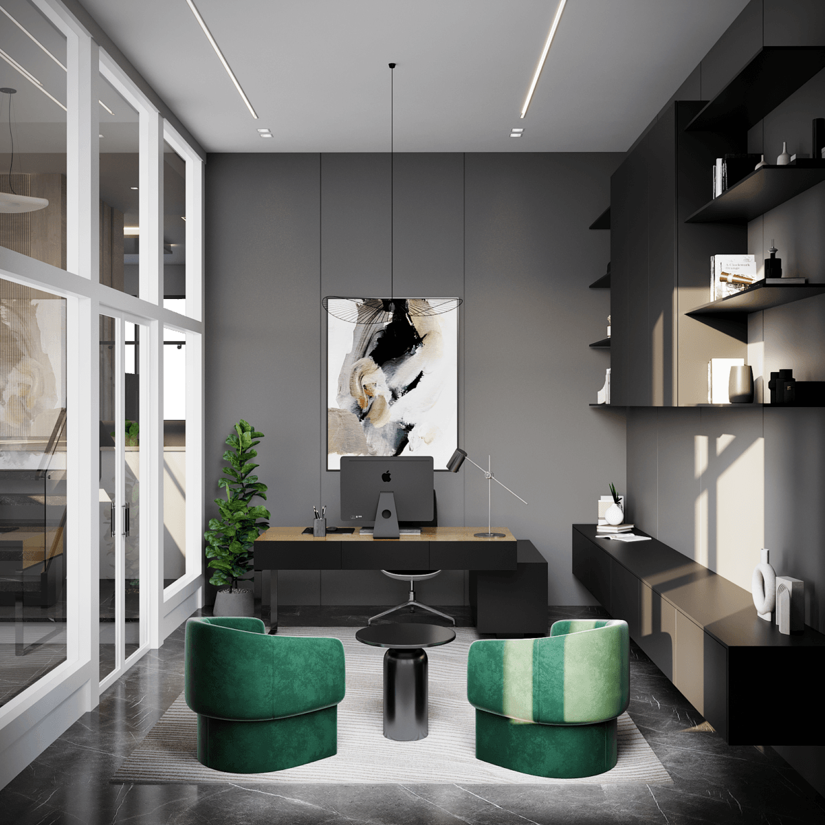
- Green: Symbolizes nature and tranquility. Green is refreshing and promotes a sense of balance and harmony, making it suitable for living rooms, offices, and classrooms.
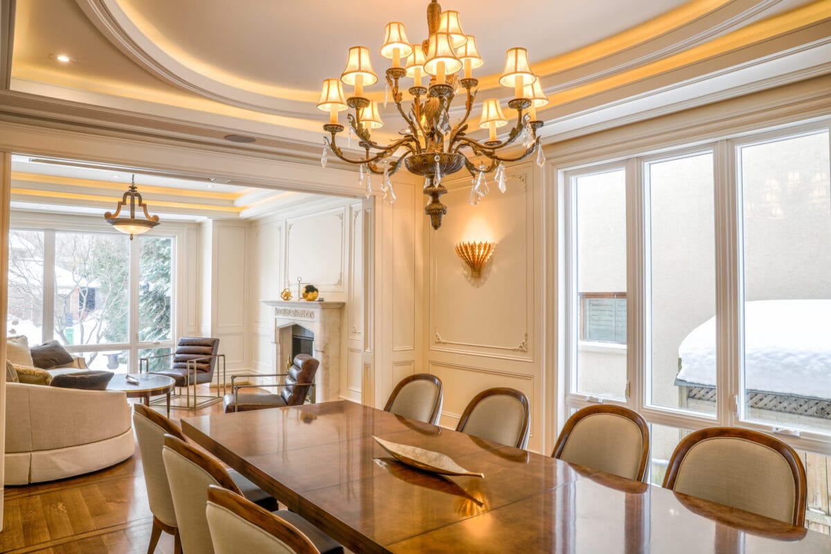
- Yellow: Represents happiness and optimism. Yellow can brighten spaces and create a cheerful atmosphere, perfect for kitchens and dining areas.
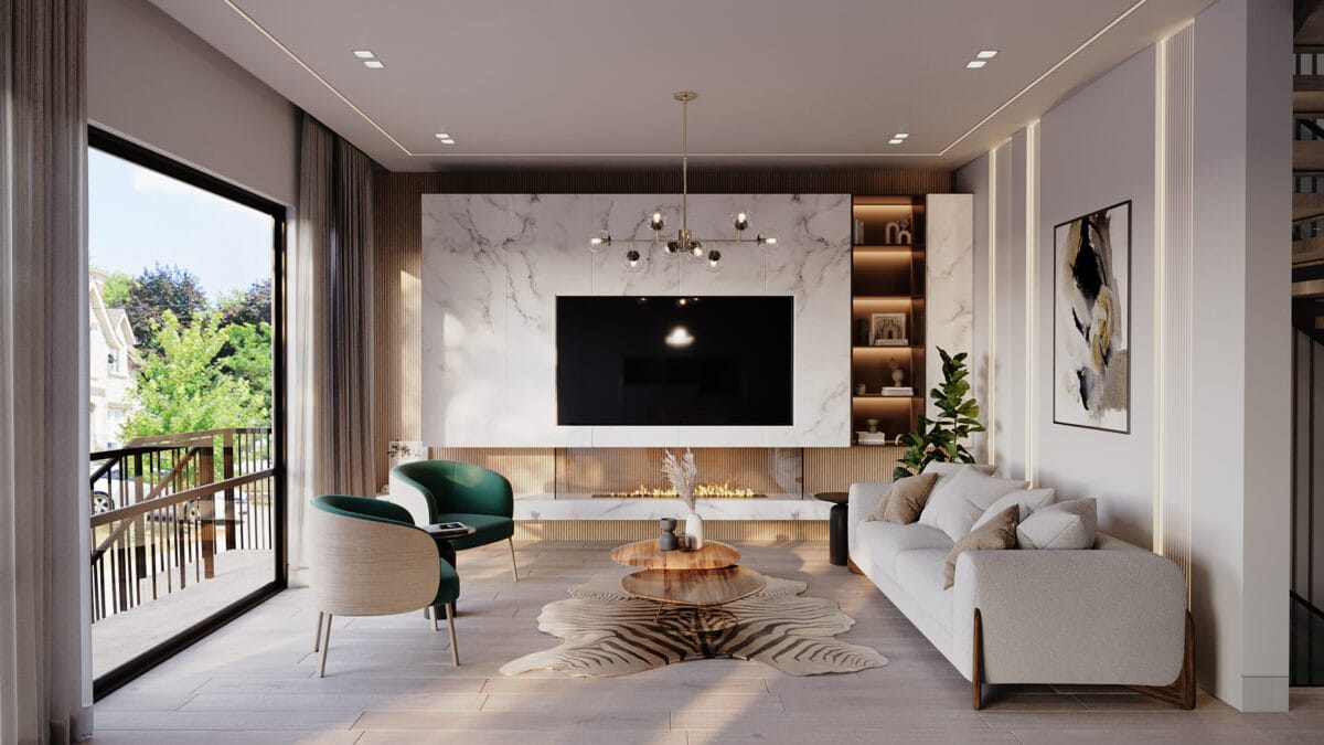
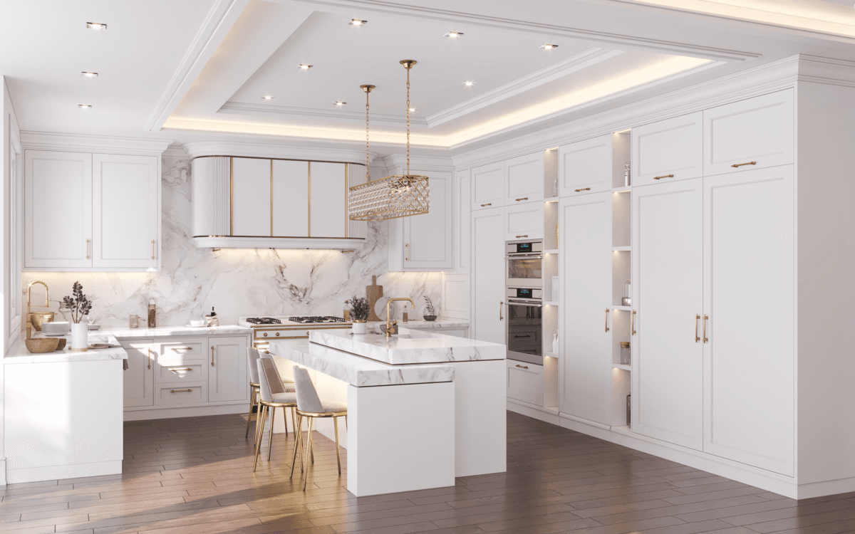
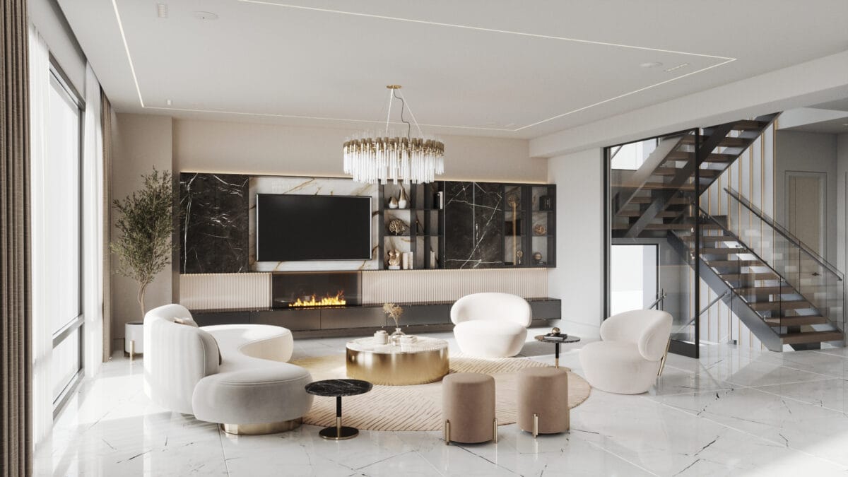
- White: Signifies purity, simplicity, and spaciousness. White is versatile and can make small spaces appear larger and more open.
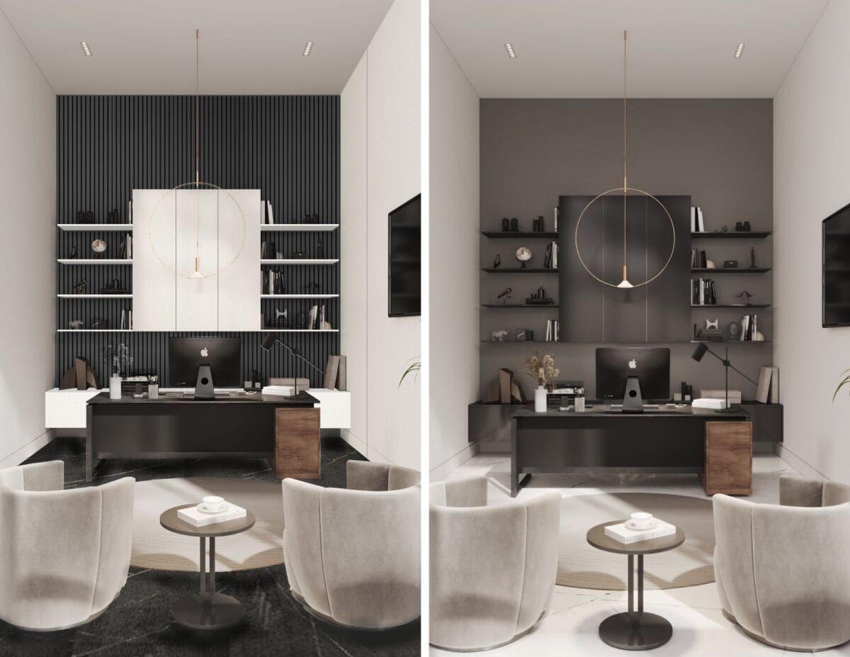
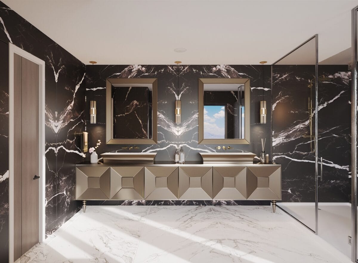
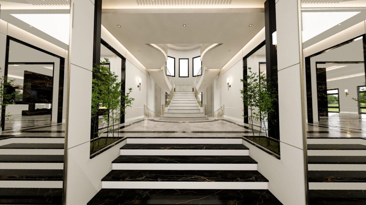
- Black: Denotes elegance and sophistication. Black can be dramatic and stylish when used in moderation, often in contrast with lighter colors.
Applying Color Psychology in Interior Design
- Living Rooms: Use warm and inviting colors like soft yellows, greens, or beiges to create a cozy and welcoming environment. Accent walls in vibrant colors like red or orange can add energy and stimulate conversation.
- Bedrooms: Opt for calming shades of blue, lavender, or pastel colors to promote relaxation and restful sleep. Incorporate soft lighting to enhance the soothing effect.
- Kitchens and Dining Areas: Bright, cheerful colors like yellow or light orange can stimulate appetite and create a joyful atmosphere. Consider using tiles or backsplashes in these hues for a lively touch.
Creating Harmonious Color Schemes
When designing with color, it’s essential to consider the overall harmony of the space. Here are a few tips for creating balanced and aesthetically pleasing color schemes:
- Monochromatic Schemes: Use different shades and tints of a single color for a cohesive and sophisticated look.
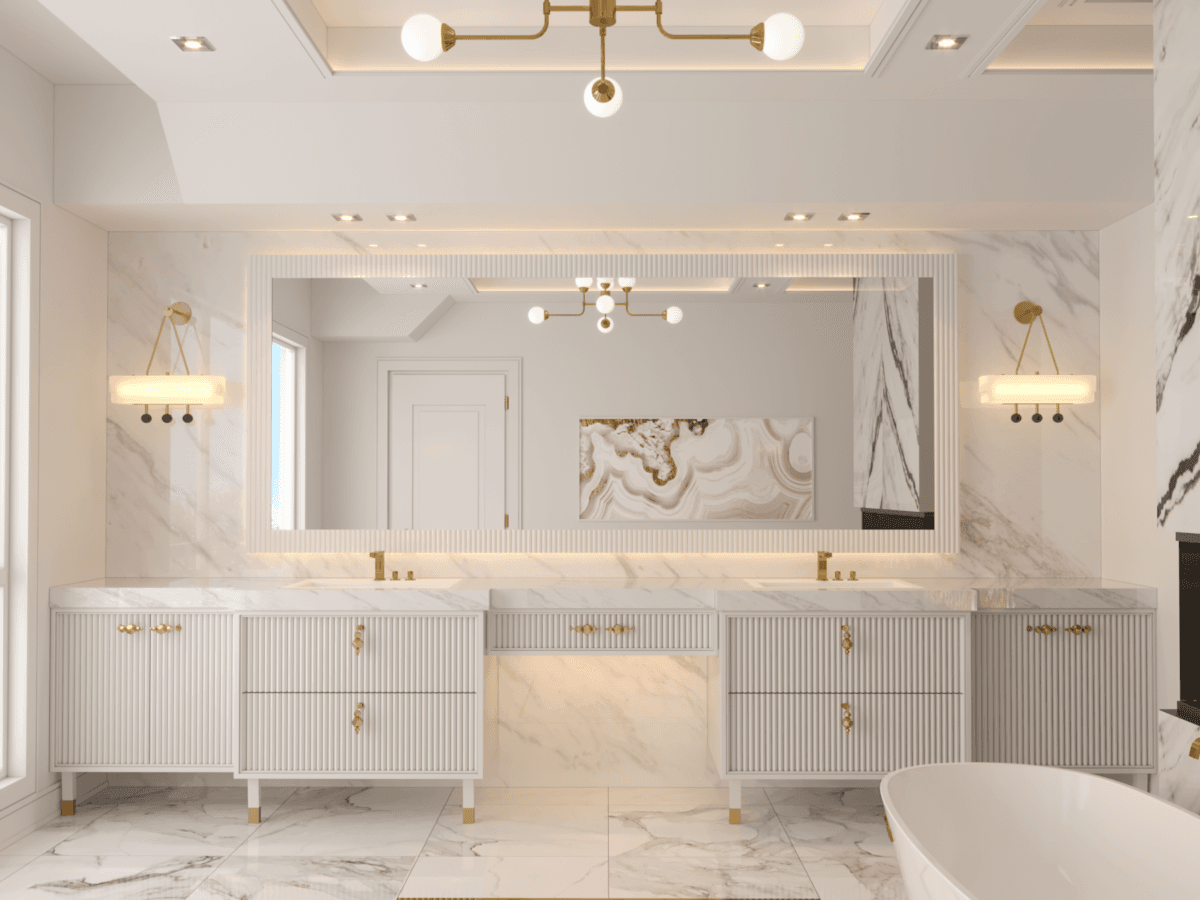
- Analogous Schemes: Combine colors that are next to each other on the color wheel (e.g., blue and green) for a harmonious and serene effect.
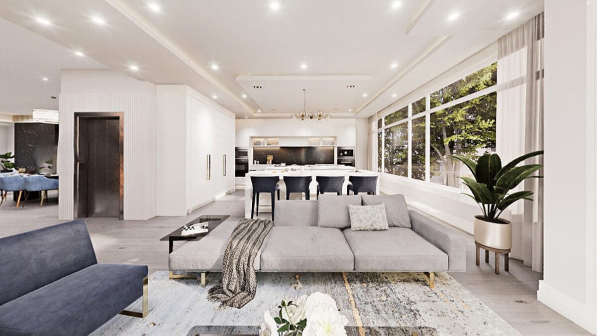
- Complementary Schemes: Pair colors that are opposite each other on the color wheel (e.g., blue and orange) to create a vibrant and dynamic contrast.
Conclusion
Color is a powerful tool in architectural design, capable of shaping our experiences and influencing our emotions. By understanding and applying color schemes, architects and interior designers can create environments that are not only visually stunning but also promote well-being and happiness.
Thank you for reading! If you enjoyed this article, be sure to check out our other design inspirations and tips for creating your dream home.
📍 1090 Don Mills Rd. Unit 402, North York, ON M3C 3R6
📞 Tel: (416) 200-9998
📧 Email: info@pmpdesign.ca
